
What Instagram's New Logo Teaches Us About Brand Refreshes
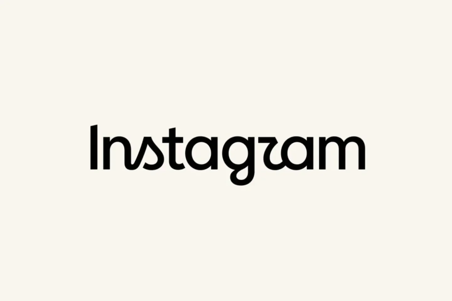
On August 13, 2026, Instagram did something it hadn't done in a decade: it changed its wordmark. Not the colorful gradient camera icon everyone recognizes on their home screen, that stays exactly as it was. The change is to the handwritten script logo that sits at the top of the app, the one people scroll past a hundred times a day without ever really looking at.
Instagram head Adam Mosseri introduced the redesign directly to users, calling it cleaner and more modern while still carrying the "simplicity and craft" that has defined the brand. The new lettering sits somewhere between cursive and print, is more compact, and gives letters like "s," "r," and "g" a rounder shape. Alongside it, Meta introduced three new proprietary typeface families: Instagram Sans, Instagram Pen, and Instagram Mono, which will show up across the app and its official materials as the rollout continues through the rest of 2026.
And within about an hour, the internet had renamed it. "Instagzam." "Instagwam." Screenshots comparing the new "r" to a "z" or a "u" spread faster than the announcement itself did. Even ChatGPT's own social accounts joined in, posting a parody wordmark of their own.
Why this matters beyond Instagram
It would be easy to write this off as a meme cycle that will fade in a week. But there's a real lesson here for any brand, agency, or founder thinking about a visual refresh.
A wordmark seen every day becomes invisible. That's actually the point of good, consistent branding. Instagram's script logo had been so unchanged for so long that it stopped registering as a "logo" at all. It just meant Instagram. The moment you touch something that familiar, even slightly, you're asking millions of people to consciously look at it again. Some will like what they see. Many will simply notice the friction of relearning something they never had to think about.
Legibility is not optional. A meaningful share of the public reaction wasn't really about taste, it was about readability. When a redesigned "r" gets mistaken for a "z," that's not a branding opinion, it's a usability issue. For any organization revisiting its own identity, the test isn't only "does this feel more modern," it's "can someone read this correctly at a glance, on a small screen, at 8am."
The reaction is part of the brand story now, whether you planned for it or not. Instagram's team clearly did their homework. Reports describe hundreds of directions explored before landing on this one, with the goal of keeping the personal, expressive feel that has always been core to Instagram's identity. That kind of process is exactly right. But no amount of internal testing fully predicts how the internet will respond in real time, and a smart communications strategy plans for that reaction, not just the reveal.
Keep the anchor, change the edges. One thing Instagram got right, even amid the jokes: the camera icon didn't move. People still recognize the app instantly on their home screen. That's a useful model for any brand refresh. Change the parts that feel dated, but hold onto the visual anchor people rely on to find you in a crowded feed of icons. A refresh doesn't have to mean starting over.
The takeaway for brands and organizations
Instagram's logo change is small in isolation, a few curves on a wordmark most people never consciously read. But it's a useful, very public case study in how a rebrand actually lands: the internal rationale is only half the story, the public's first-hour reaction is the other half, and both need to be part of the plan before launch day, not managed after the fact.
Whether you're a nonprofit updating a decades-old logo or a growing business rethinking your visual identity, the questions worth asking are the same ones Instagram's own reception is answering for everyone else right now: Is it legible? Does it keep the anchor people already trust? And are you ready for the internet to have its own opinion about it?
Perez Public Relations helps organizations navigate brand moments like this one, from the strategy behind a refresh to the communications plan for how it's received. Get in touch to talk through your next brand milestone.
